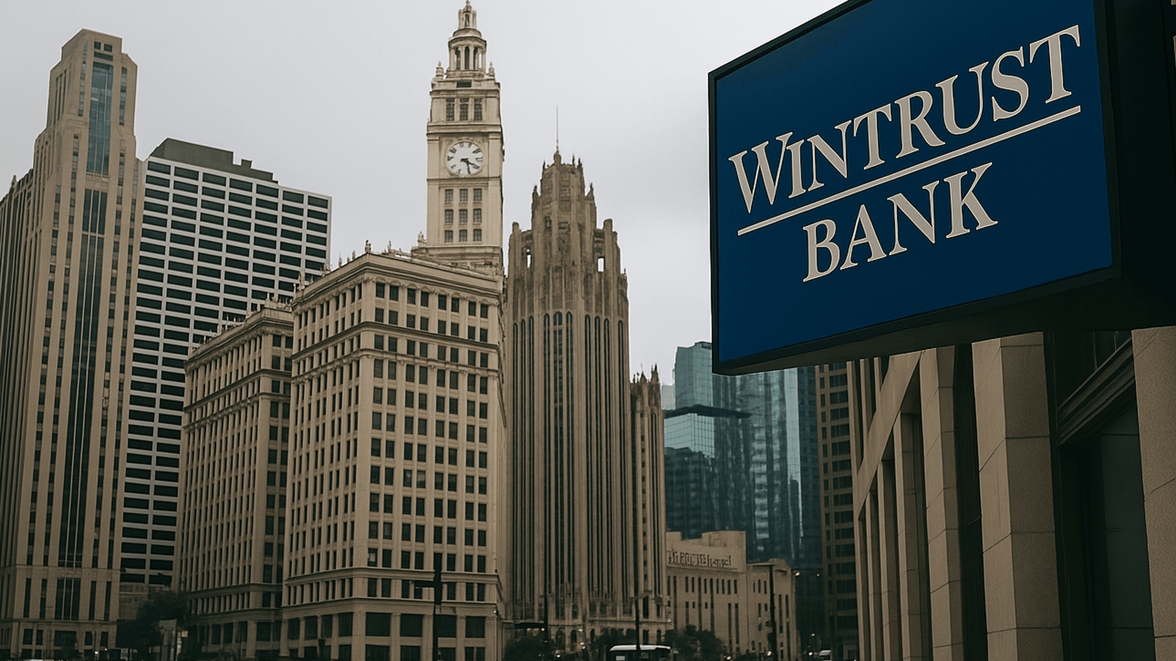
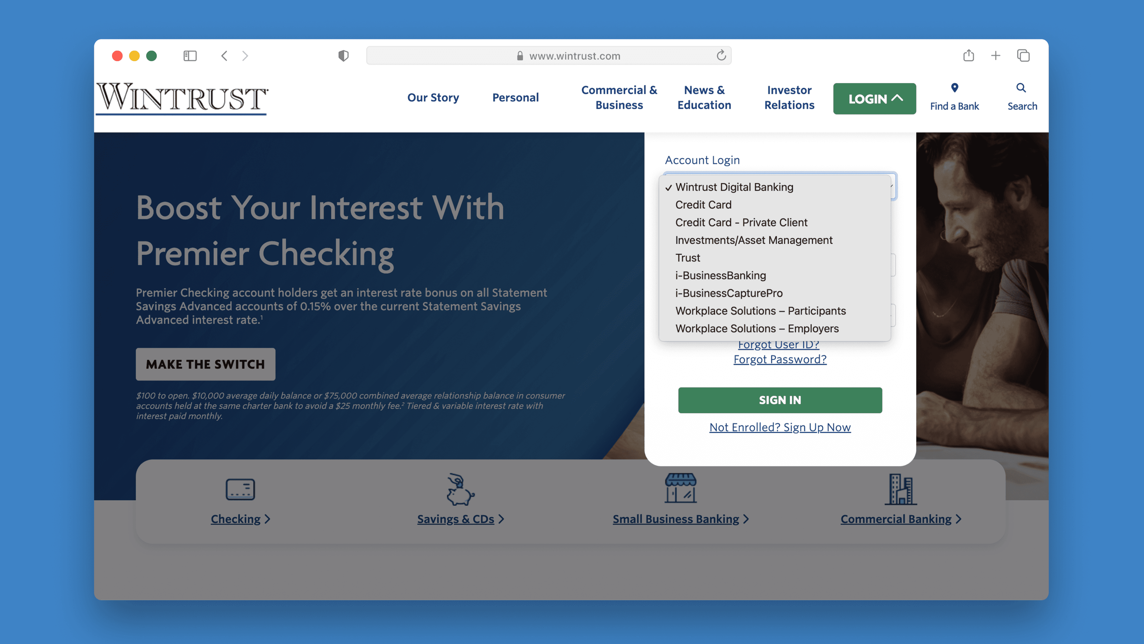
Transforming the login experience for Chicago’s digital banking customers.
One of Chicago’s leading banks, Wintrust set out to boost acquisition and engagement by introducing a guided user interface.
Design Solution

Results
30%
Boost in Lead Conversion
35%
Reduction in Bounce Rate
42%
Enhanced User Engagement & Acquisition
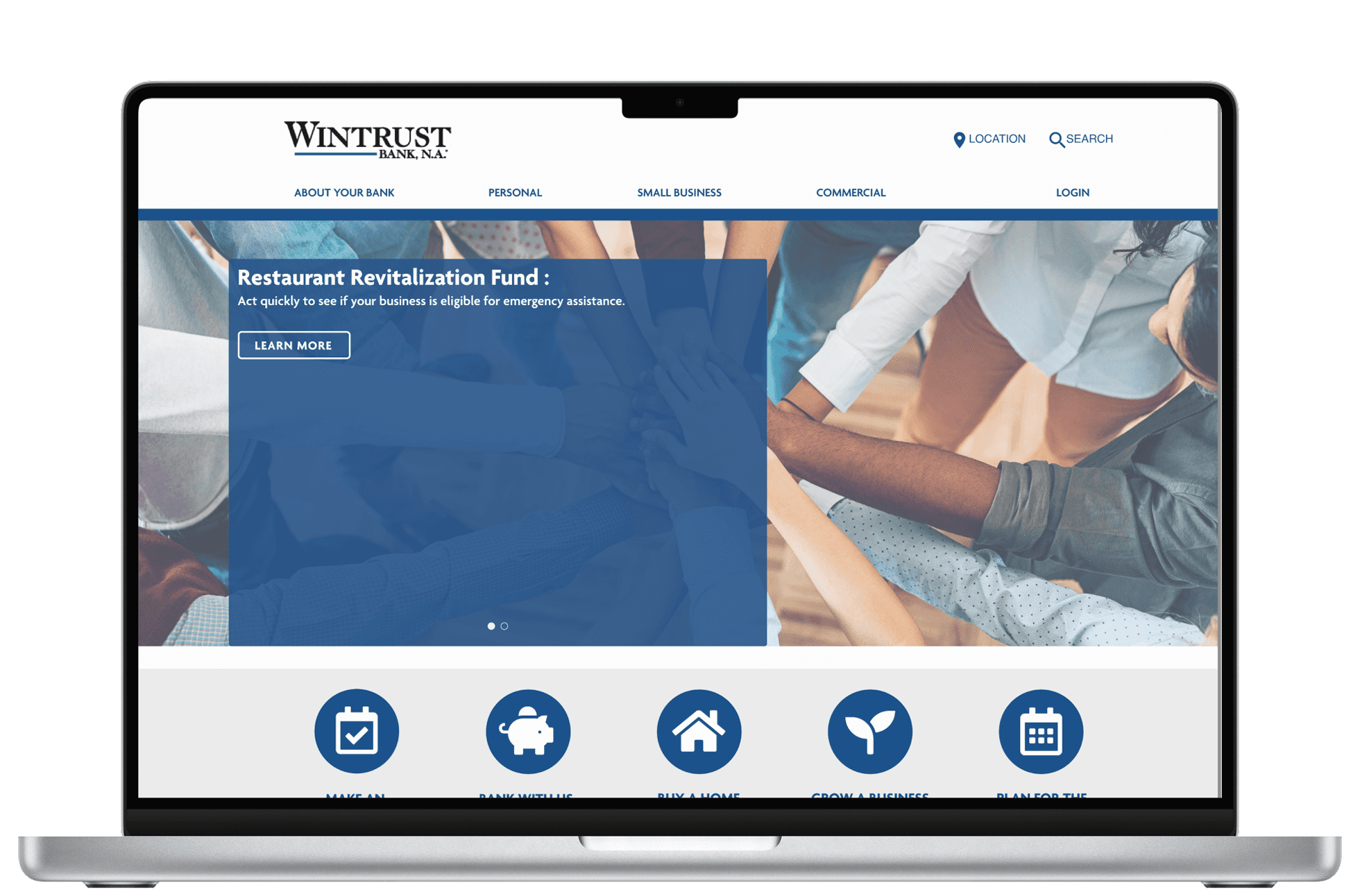
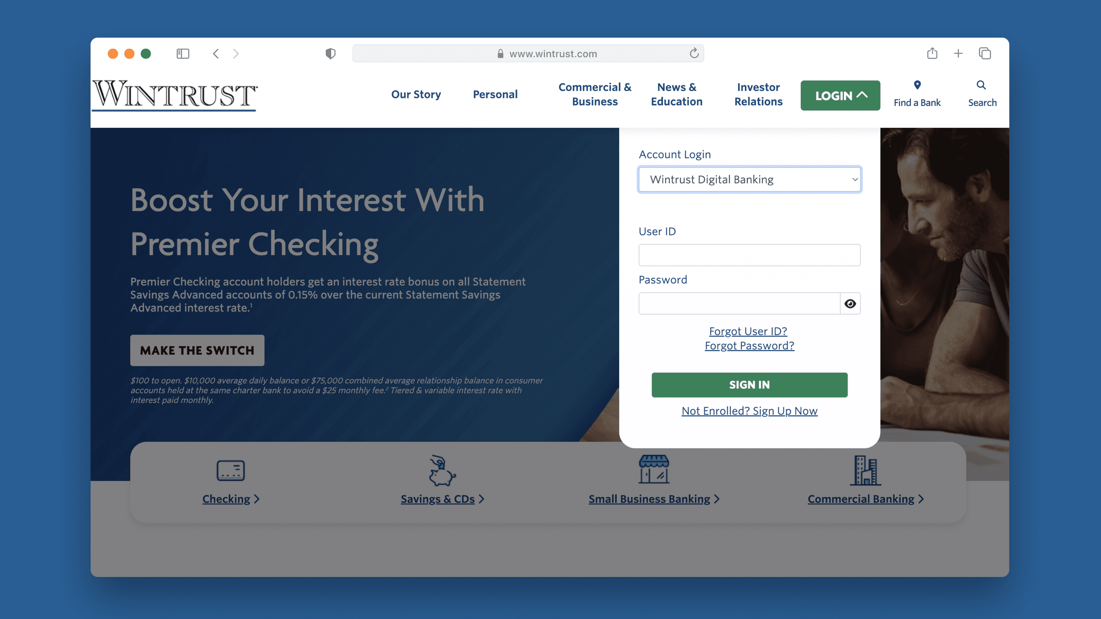
Previous Website
I started by…
Ensuring the solution was grounded in real user needs,
I structured my process into three phases :


Step 1
Identified a clear gap in understanding our customers’ wants, needs, and expectations
Current frustrations and pain points?
What did they really want?
What did they really need?
Step 2
Dived into an intensive 2-week
research sprint.
11+ user interviews with existing and potential banking customers
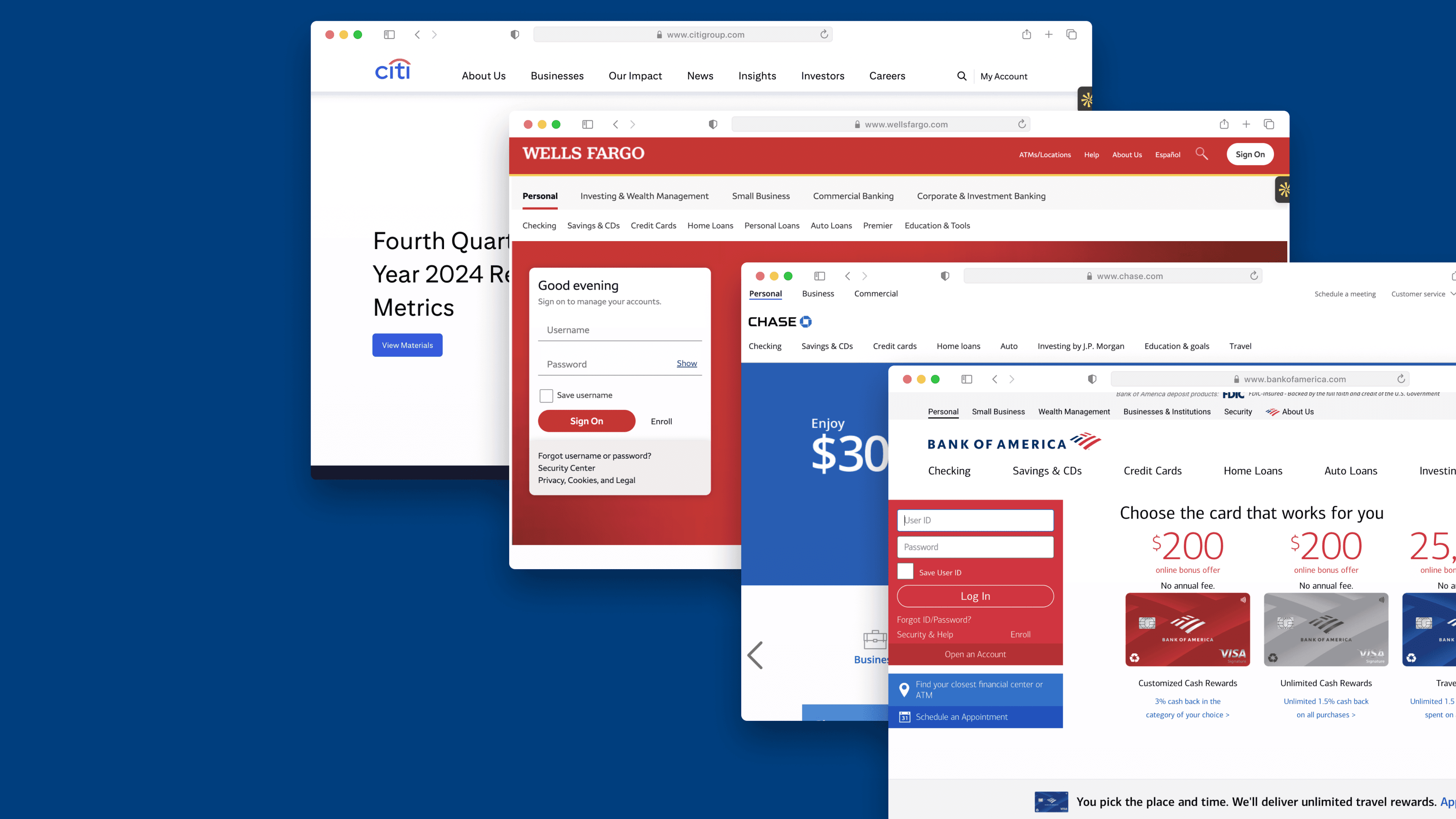
Conducted a SWOT and competitor analysis across 4 major U.S. banks
Takeaways
Competitor Analysis
User Interviews
Problems Idenitified
Lack of Visual Clarity & Feedback in Login Flow
High digital maturity and market trust of leading banks.
Login functionality was treated as secondary, not primary.
Strong brand identity and clean UI layouts.


Step 1
Overwhelmed with insights, I needed to start prioritizing to form a strategy.
Understand key painpoints, wants and needs.
Classify all insights gathered.
Present the synthesis to stakeholders.
Step 2
Jumped into secondary research to form our product strategy and experience.
Understand key painpoints, wants and needs.
Classify all insights gathered.
Present the synthesis to stakeholders.
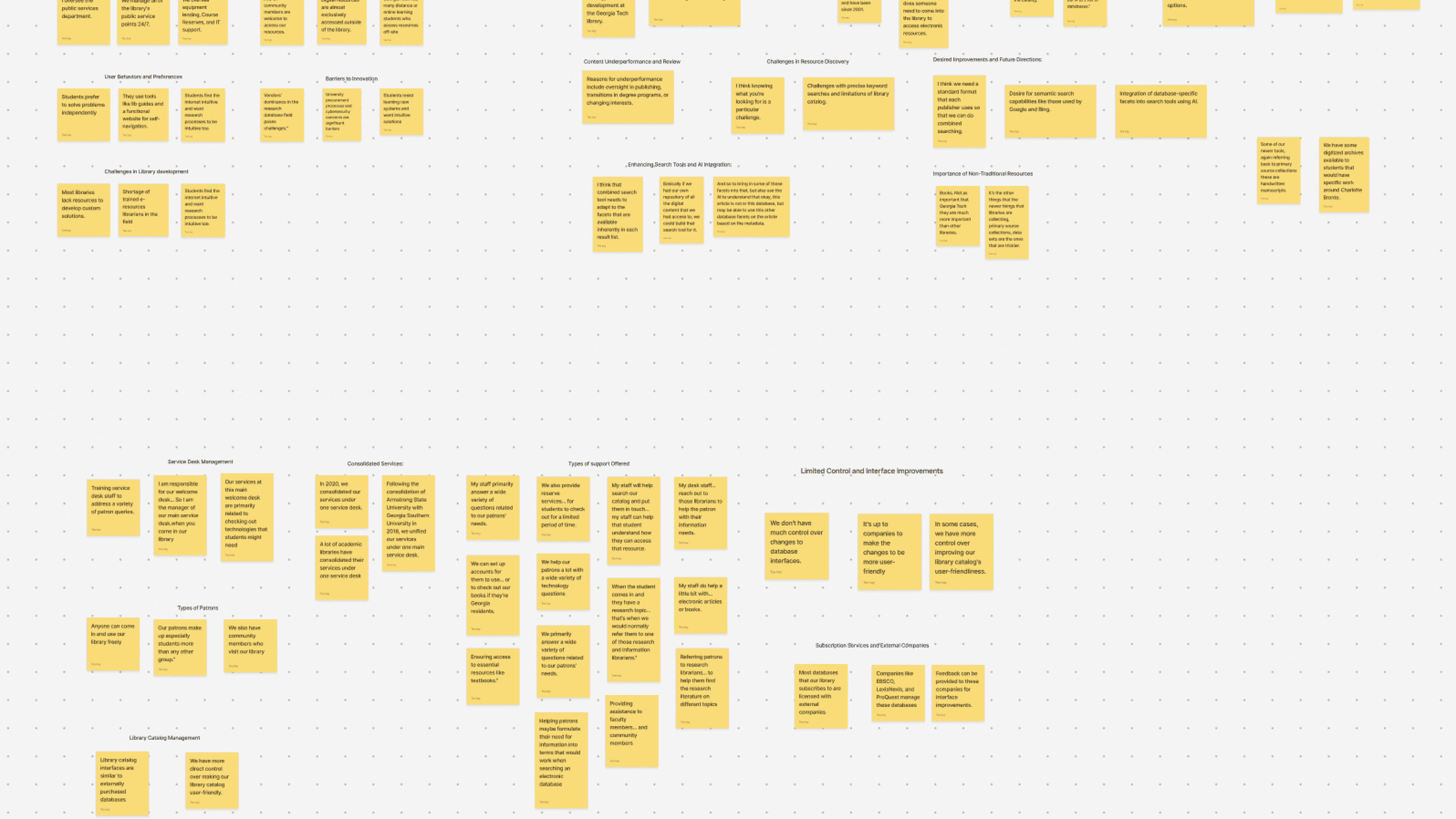
Affinity Maps
Affinitisation helped me discover…
Users lacked confidence in the platform due to visual inconsistency and outdated UI.
Users weren’t sure if they had made an error, the system offered no confirmation or feedback.
Users came with intent, but the interface didn’t support task-first behavior.
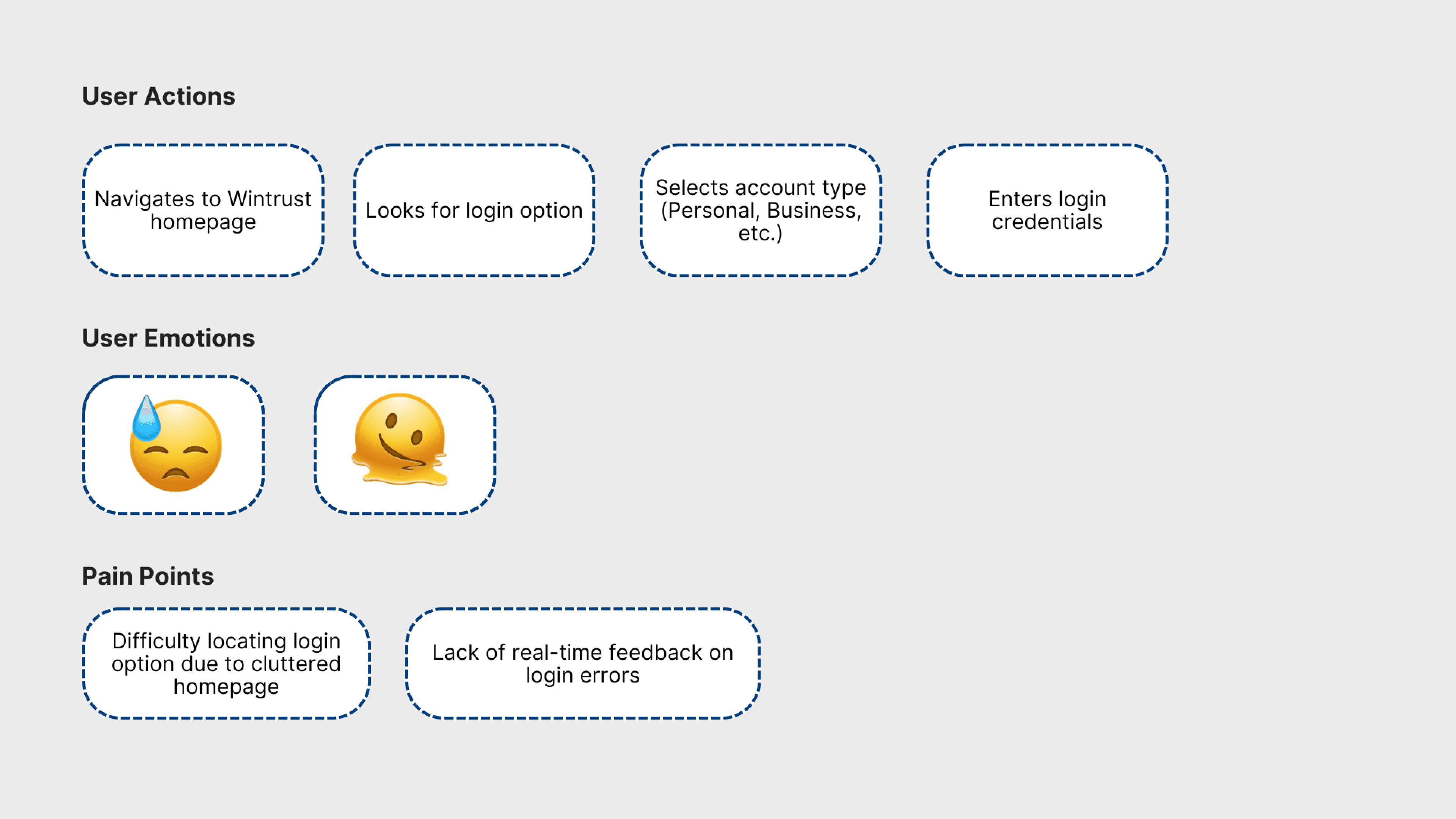
Customer Journey Map
Customer Journey revealed…
Emotional friction across the full experience of the website.
Identified the exact stages where users lost momentum.
Connected disconnected insights into a user flow narrative
Takeaways
Users lacked confidence in the platform's visual design.
Lack of real-time feedback created uncertainty and frustration.
Friction peaked during specific interaction points.

Step 1
I was on a very tight deadline and developers needed to start building soon.
Should the conversational UI lead with desktop or adapt mobile-first?
How could I establish visual trust while staying aligned with Wintrust’s brand identity?
What design decisions could reduce dev handoff friction and speed up implementation?
Step 2
Once the goals and constraints were aligned, I moved into design execution quickly.
Designed responsively, optimizing first for desktop, then adapting to mobile.
Focused on the login flow and homepage as high-impact entry points.
Built a flexible design system that followed Wintrust’s established brand language.

Design System
What did I do?
Aligned with Wintrust’s brand guidelines.
Created reusable components.
Defined interaction patterns.